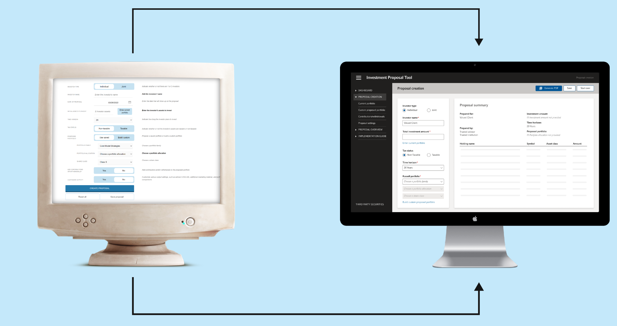

Investment Proposal Tool is a web tool that allows financial advisor to generate an investment proposal for a client. My task was to give the tool a fresh look using the new design system.

While improving the UI of the tool I found many opportunities to fix UX issues as well. Please take a look at the examples below.
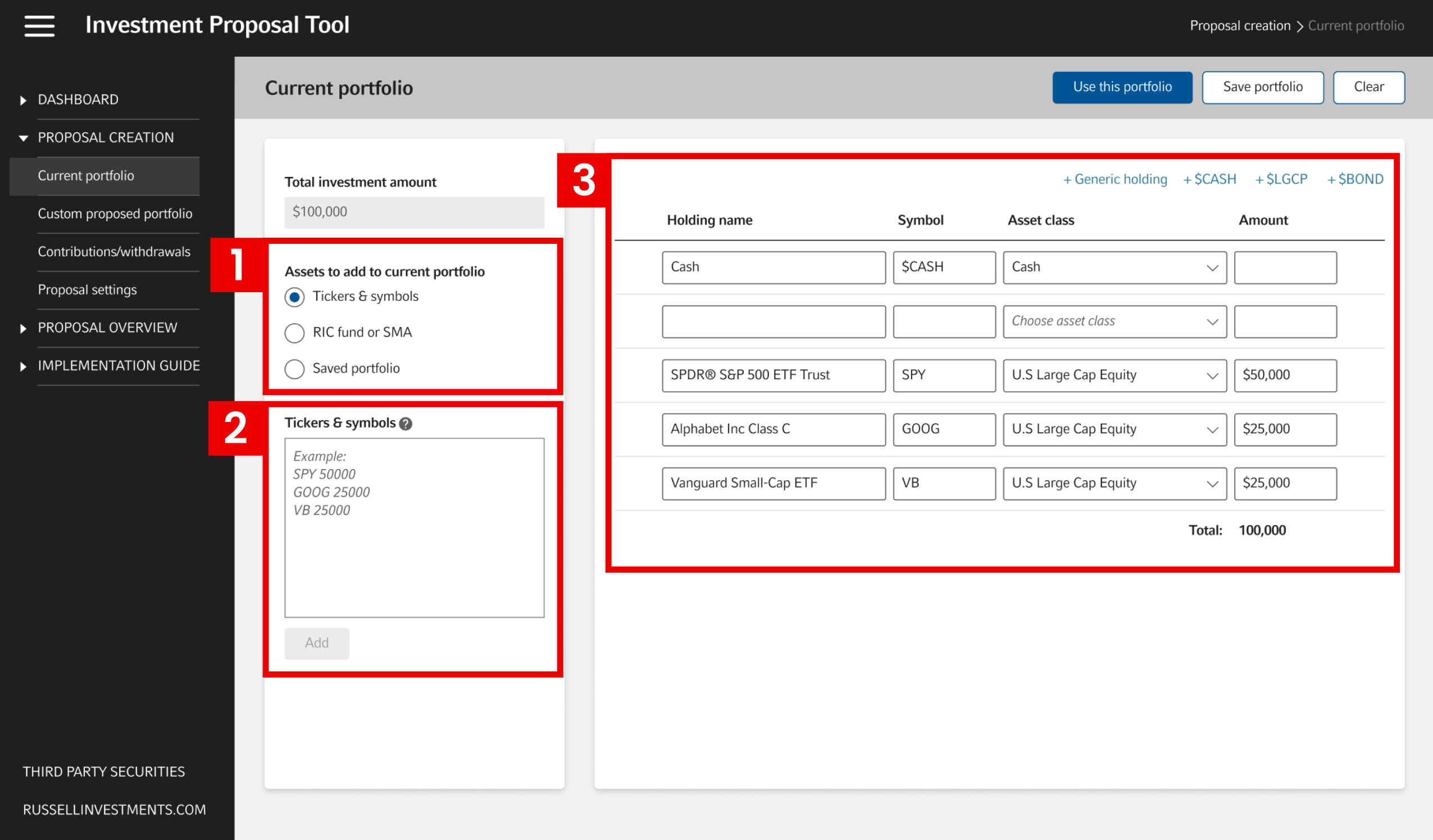
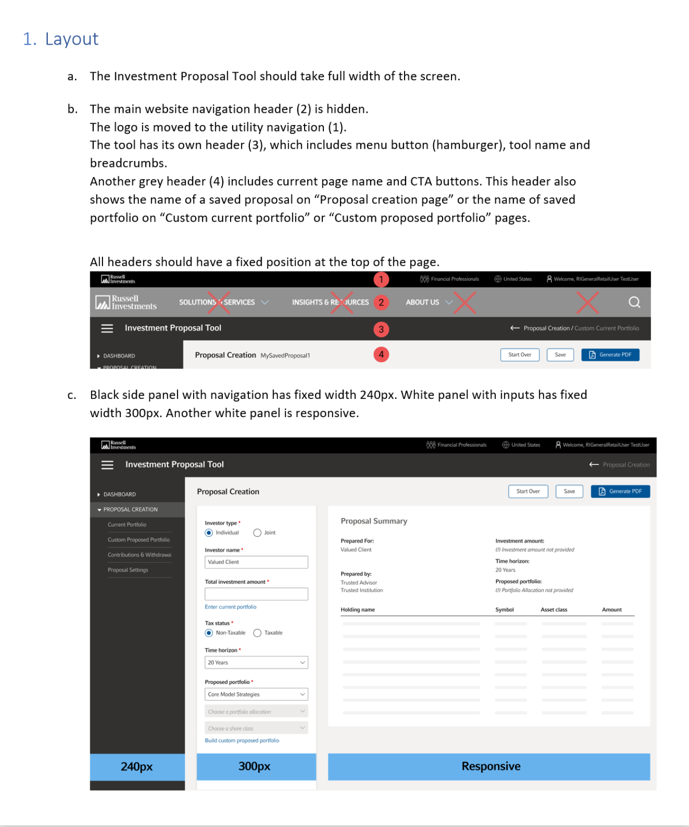
For data heavy applications full screen design is a better choice. This allows showing more data on one screen. You can also use a bigger font size, hence increase the legibility.
I wanted to make sure the tool will look good on most used screen sizes. Based on screen resolution stats I knew that most of our users will have 1920 monitors, but 1280 are used often too.
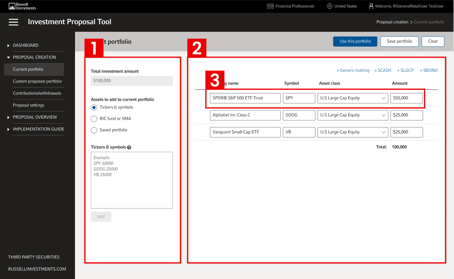
Previously the user had to use accordion to select the data that can be edited in the table. The accordion and the table were located on different screens.
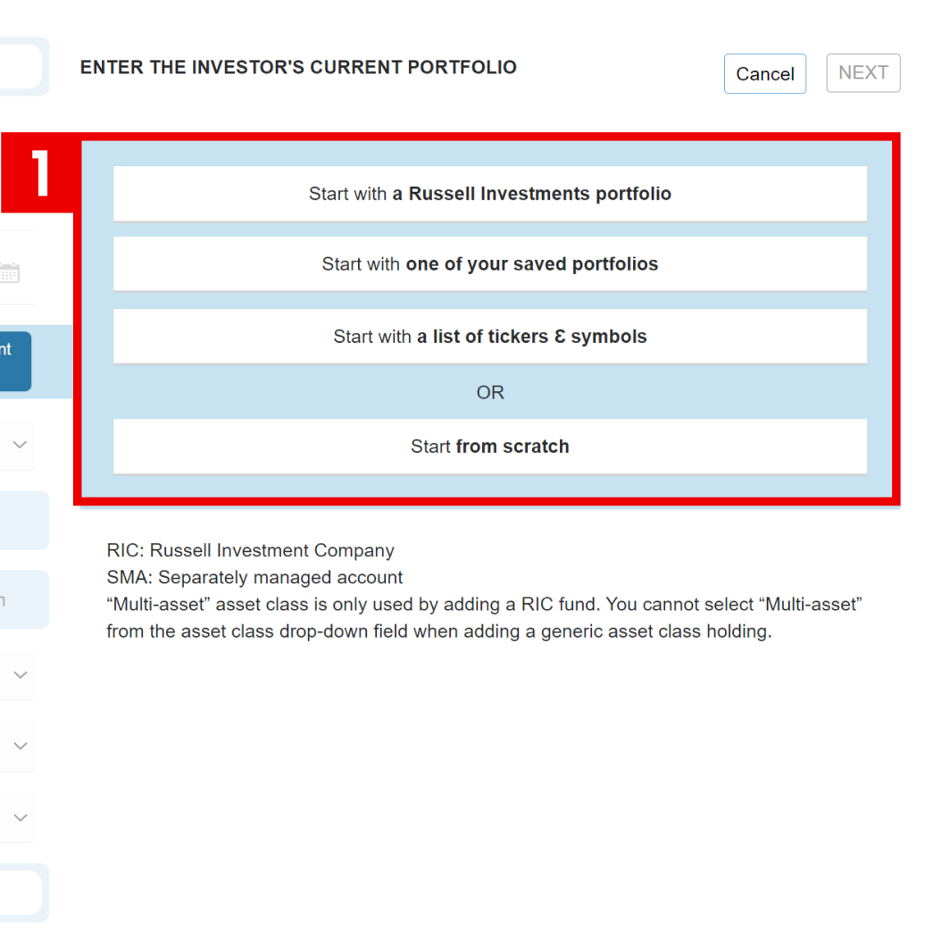
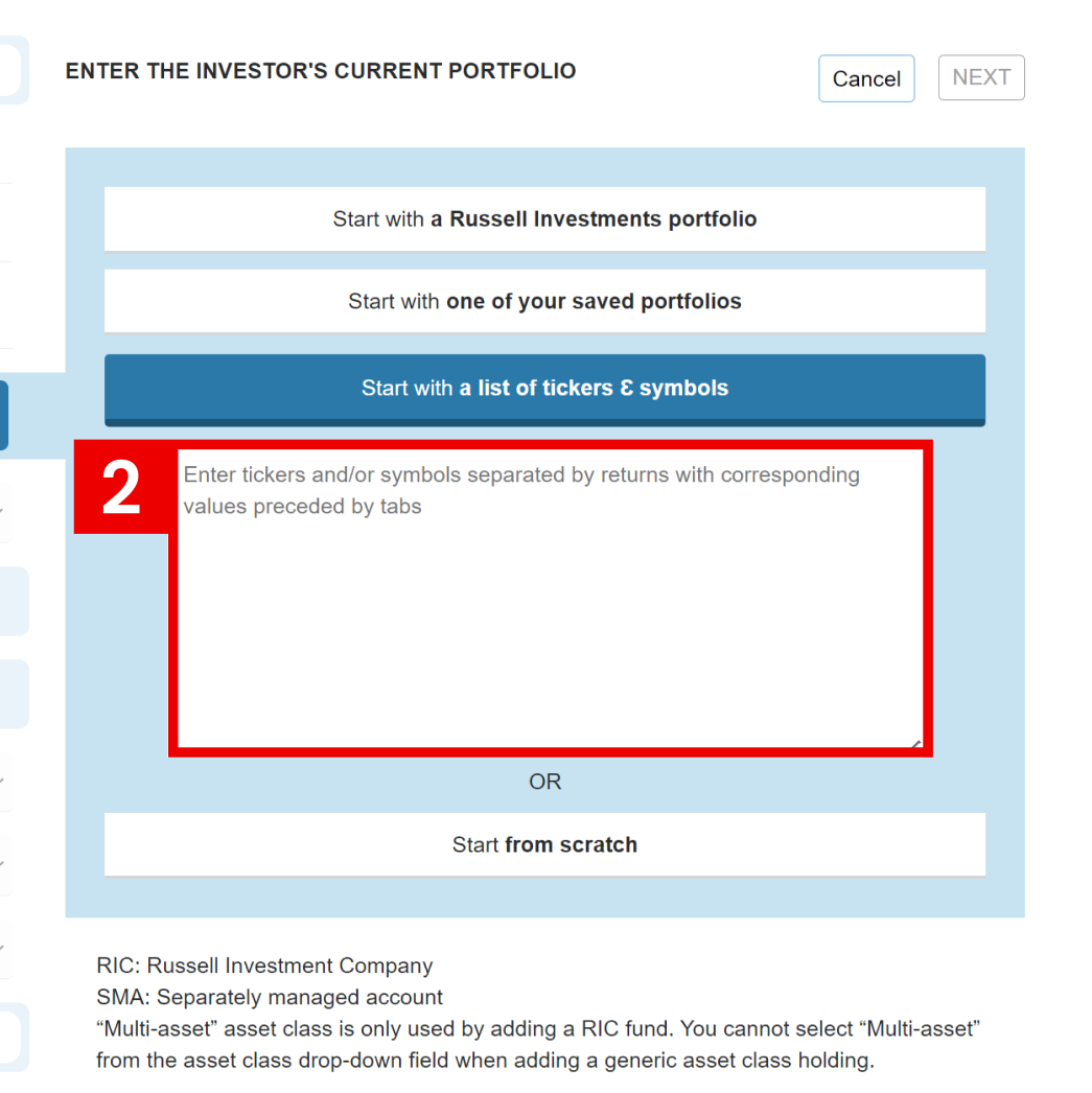
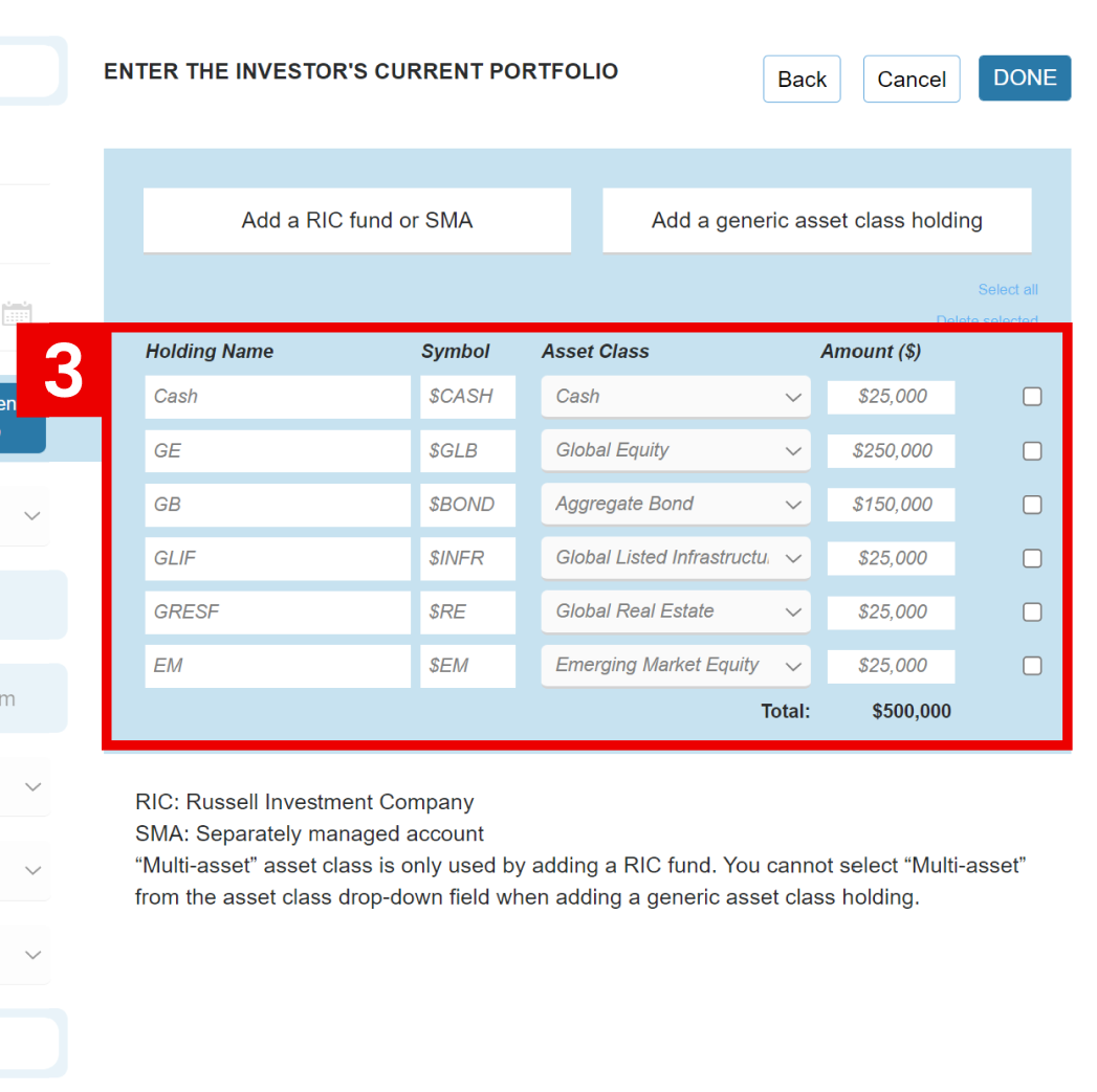
I have grouped everything on one screen. Instead of accordion I’ve used radio-buttons. The most used data type is selected by default and respective input is available right away.
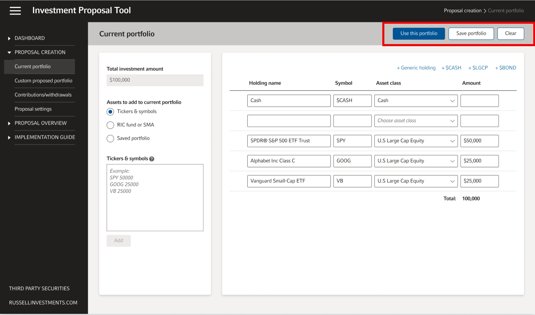
Primary and secondary action buttons of the old tool are located all over the place. The position and the design of those buttons are not consistent.
New main buttons are located in the right side of the header. The header has a fixed position and is always visible.
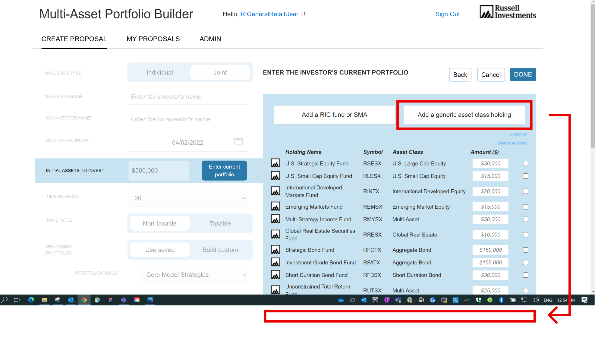
I’ve noticed that at some point a user won’t be able to see all rows of the table at once. If now user clicks “Add a generic asset class holding”, nothing is going to change on the screen, because the new row will appear at the bottom, below the viewport.
To make mattes worse, this button doesn’t have “hover” and “pressed” states. User might think that the button doesn’t work at all.
I fixed this problem by making new rows always appear at the top of the table.
To remove a row in the old table you had to select the row with the checkbox first, and then click the delete button.
The improved table shows a trash can icon-button on row hover and allows you to delete that row in one click.
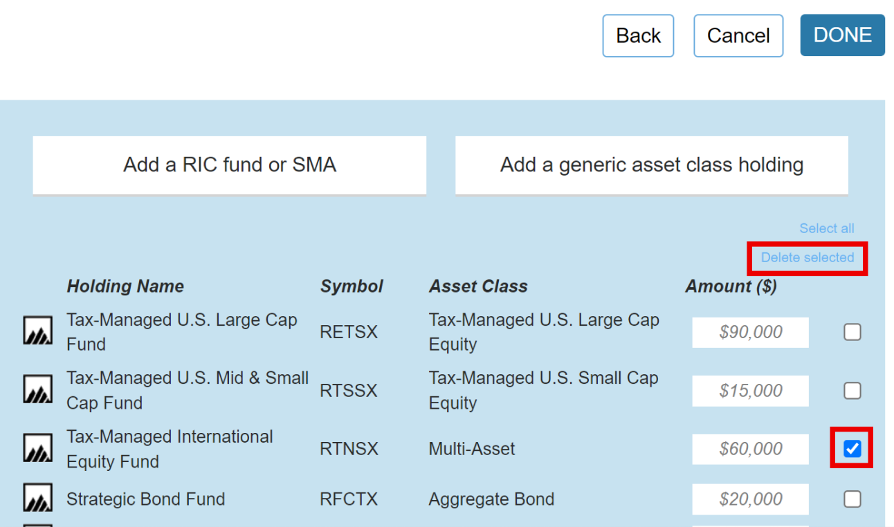
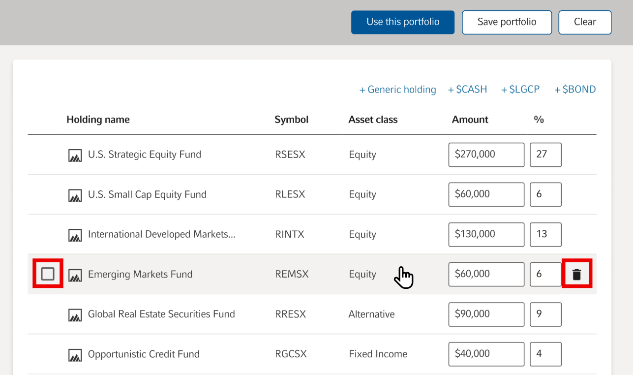
You can use checkbox method too. Respective checkbox will be shown on hover as well.
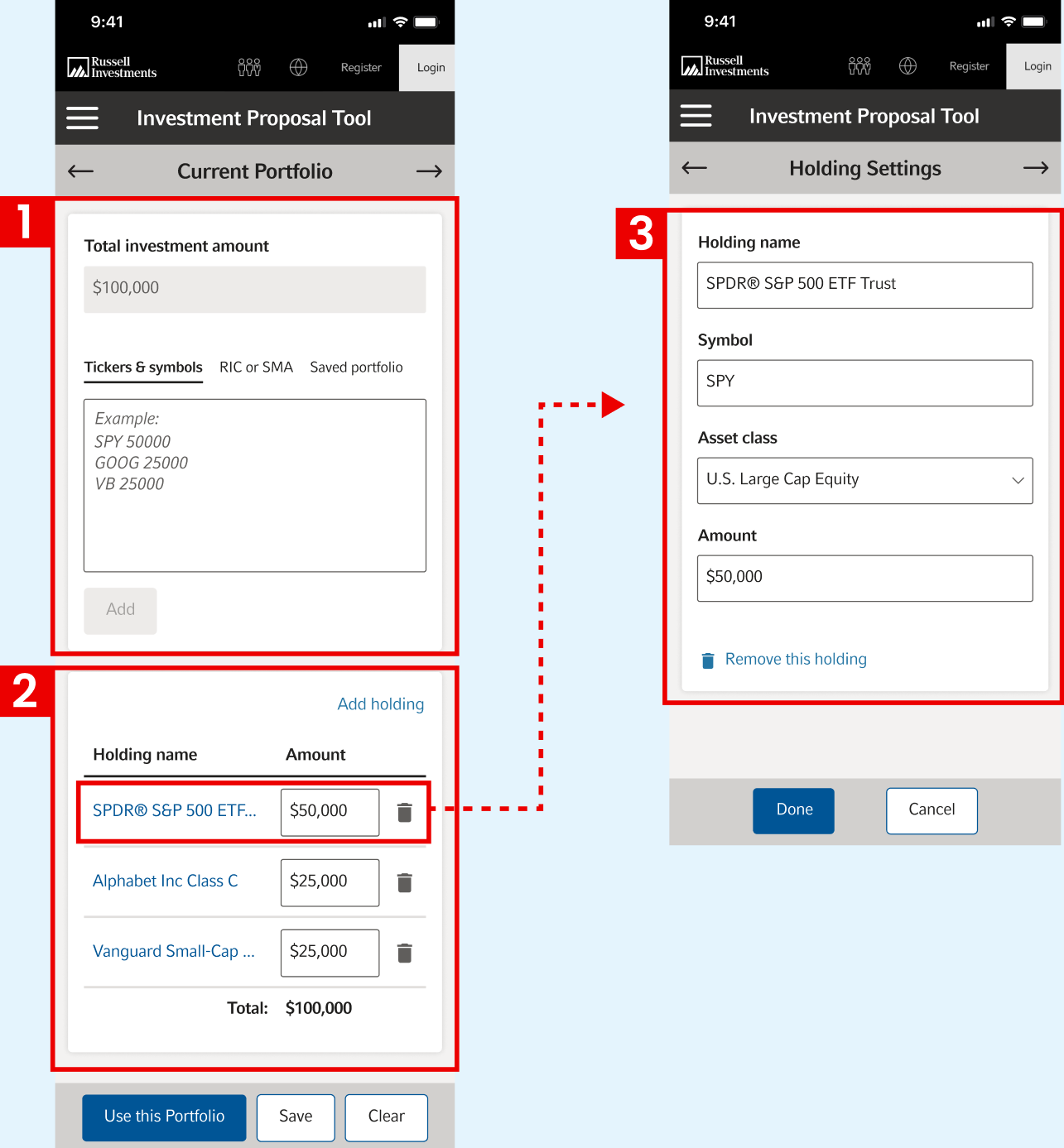
Even though the tool is supposed to be used on desktops, we decided to design a mobile version too. The hardest part was to fit a page with the table on a narrow mobile screen.
I created two sections: The top section with all inputs (1), and the bottom section with a simplified table (2). I moved all secondary input fields of a row to a separate screen (3).
My first method to avoid unnecessary frames is to create variants of a complex component and create interactions within that component.
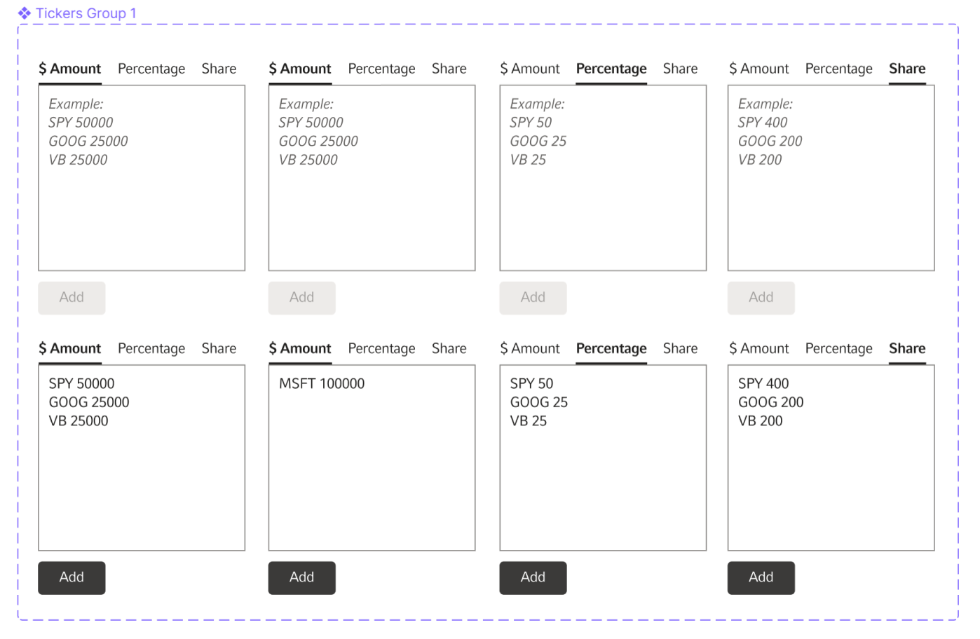
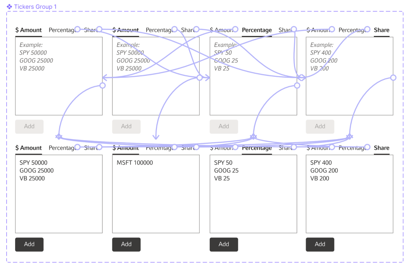
In this example I can show 7 different states using the same component on one frame: when each tab is selected and when some specific inputs have been provided.
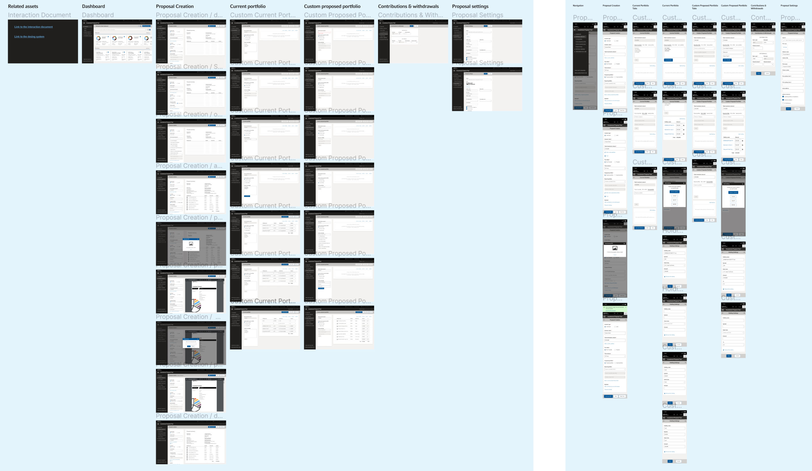
For the final design file I try to avoid creating to many frames. Lots of frames slow down the tool. This also makes it hard for developers and stakeholders to navigate the file.
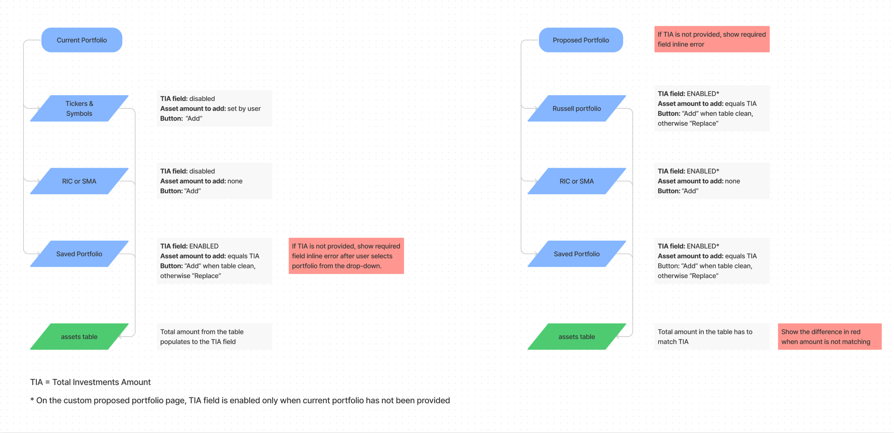
My second method is to create a document. This document will contain design specifications, detailed instructions about the behavior of the tool and links to all necessary assets.
A complex tool will allow multiple combinations of inputs which would require countless design frames to showcase. I prefer to include only the most used scenarios in the prototype. The rest will be included in the document.
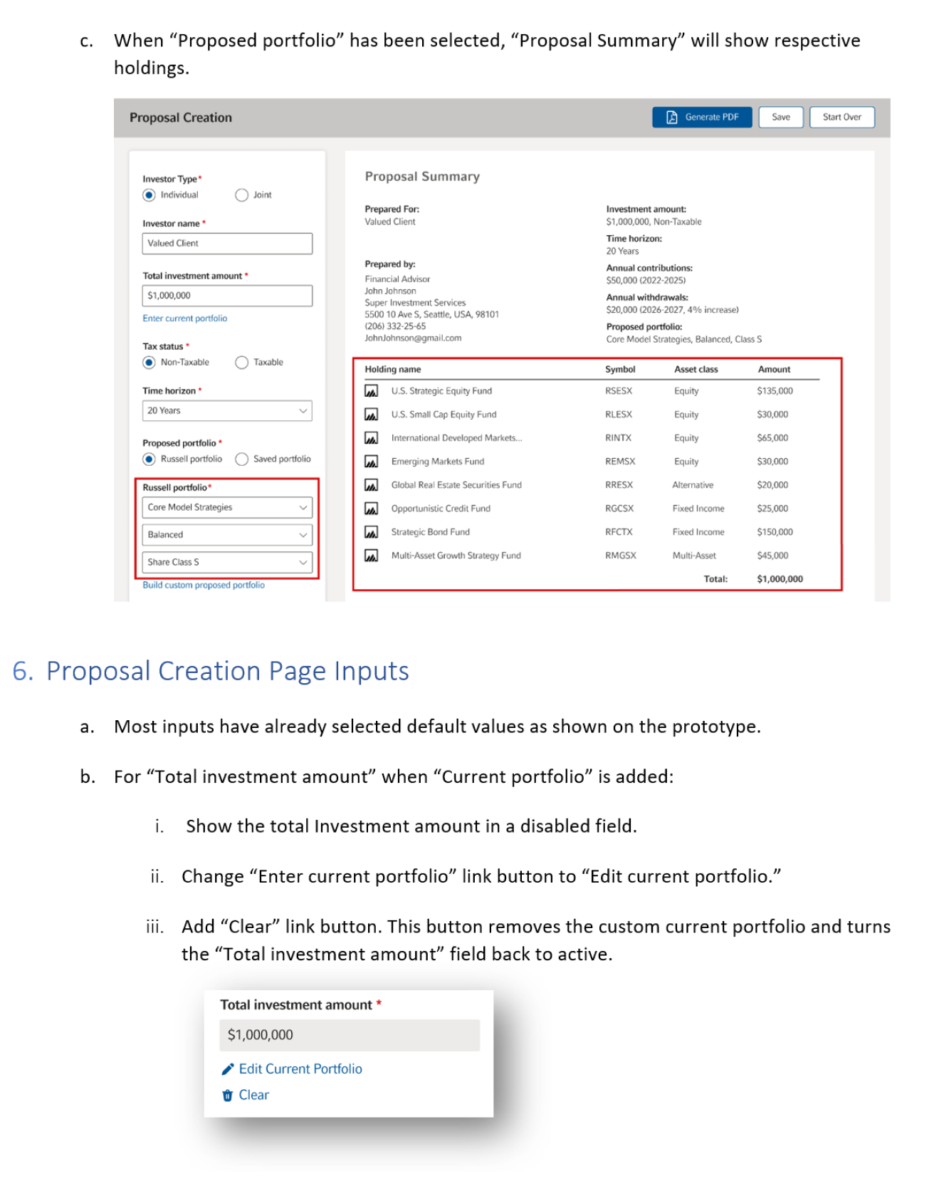
Document excerpt 1
Document excerpt 2
I also like to create all sorts of charts which can help to explain a complex behavior.